Improved performance
This version provides significantly faster response times and better scalability due to improvements in multithreading on the UXT Server. On average, the UXT system will respond three to four times faster than previous versions. Even greater improvements (up to 1000x faster) are possible on large data queries.
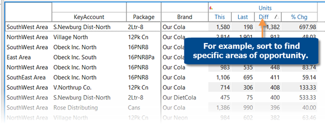
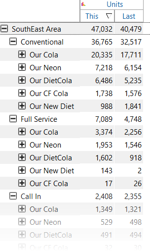
New multi-dimensional grid (i.e., flat view)
A new multi-dimensional grid expands attributes into columns to provide a customized, granular view by multiple dimensions. Each unique combination has its own row. You can interact with rows by drilling, sorting, etc., to investigate any cross-sections of data. This new grid is called a “flat” view because it removes the constraint of built-in subgroupings. The flat view is instantly available without needing to expand rows, making it a much faster option than “expanding all” members. As usual in SIM, you can choose the hierarchy and up to five dimensions to expand; therefore, you have complete control over how the data is presented.
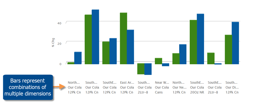
Multi-dimensional bar graphs
You can view multi-dimensional data in bar graphs to visually compare cross-sections of data. This new capability is available in comparative and multi comparative graphs that show percent change, difference, or actual values. For example, view the top combinations of brand, package, and region. Up to five levels of data are available.
Learn more about flat view and multi-dimensional bar graphs:

Sunburst
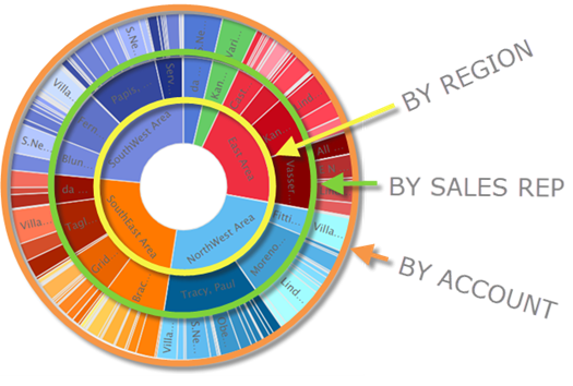
A Sunburst graph shows the hierarchy and magnitude of data through a series of rings. The center ring represents the top-level data (1st By); the data becomes more granular as you move outward. The slices are sized based on values and aligned with their parent level to show the relationship of the data and how much each piece contributes to the total. For example, what are the top accounts for each sales representative in each region? The Sunburst can include up to five levels of data to provide a complete picture across multiple levels in your organization.
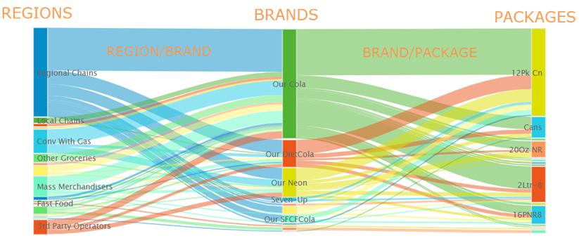
Sankey graph
This new diagram shows how data is funneled between multiple dimensions. The band width represents the magnitude of the data. The bands start at one dimension and connect to another dimension to show the make-up of each member and how the data is related. A simple Sankey connects two dimensions; a more complex Sankey can connect up to five dimensions. For example, visualize the breakdown of brands within each region and packages for each brand.
Learn more about sunburst and sankey charts:

Faster tree expansion
You can automatically expand dimensions to see underlying data. Just turn on the auto-expand option and then pick the dimension(s); all its members will be expanded to the next level. You can expand multiple levels to create a customized tree of performance metrics.
The “expand all” menu option is still available and is generally faster in this version than previous versions due to more efficient processing. However, you may prefer to use auto-expand rather than expanding all because this new capability can be accessed via a single-click in the context panel. In addition, the auto-expand tool expands members dynamically as the context changes. For example, new members will be automatically expanded if you change the drill path to include different data.
Highlight percent change data in graphs
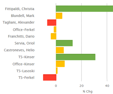
You can highlight data in percent change bar graphs to quickly identify variance outside of your expected ranges. As always, highlight settings can be customized, saved, and shared. Highlighting is available in multiple types of percent change graphs, including Comparative Dimension Members, Comparative Time, and Multi Comparative.
For example, highlight significant changes in performance among sales representatives, regions, accounts, etc.
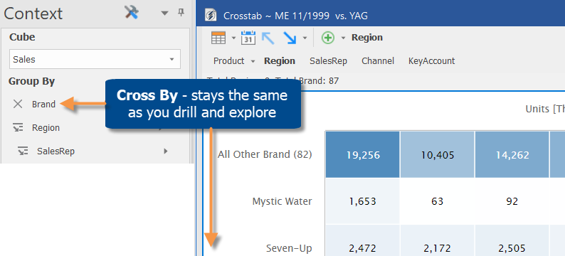
Intuitive hierarchy in Crosstab (two-way) charts
You can now select a Cross By attribute that is independent of the drill hierarchy. This enhancement allows you to keep a consistent view of the data as you drill and explore in Crosstab analyses.
Ease-of-use enhancements
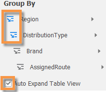
More options for grouping the data
Like in previous versions, the Change By dialog (accessed by clicking Group By in the context panel) provides a single access point for changing multiple levels in the drill hierarchy. Now you can drag and drop in this window to put dimensions in your preferred order. You can also right-click on any dimension to select from a menu.
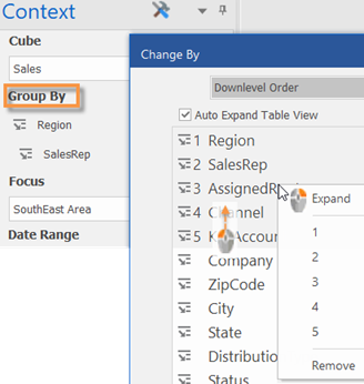
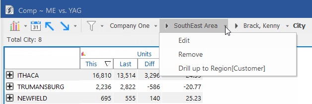
Drill-level menus
The breadcrumb path provides new menus for selecting the drill level. Just click the drop-down arrow beside any item to edit what you are drilled on, remove the drill level, or drill up to that level.
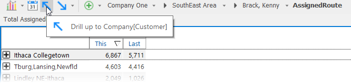
Drill up through multiple levels at once
After drilling down on multiple levels via expanded rows or flat view, you can quickly drill back up through these same levels with a single click on the uplevel button.
Version compatibility:
Required server version: 8.0 (no Metaserver available)
Compatible Salient Dashboards version: 8.0
Learn more about SIM versions: