Notification enhancements
(in V8.4.7+)
- You can embed notification data directly within a message to provide easy, automated access to data.
- Recipient filters allow you to efficiently manage the distribution of relevant data to multiple users.
Watch a video:
To learn more, go to the full notifications video.
Better sorting
(in V8.4.7+)
Custom sorting options provide full control over how the data is ranked.
- Choose multiple levels to rank members that have the same values (e.g., rank customers or products with zero sales based on another measure).
- Sort multiple ways in a two-way (Crosstab) grid.
Watch a video:
New mix (percent of total) calculations
(in V8.4.7+)
You can add new mix calculations to see share of the market multiple ways in Crosstab (two-way) grids:
- Percent of the total of all columns
- Percent of the total of all rows
- Percent of the overall total (all columns and rows)
Watch a video:
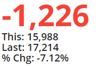
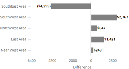
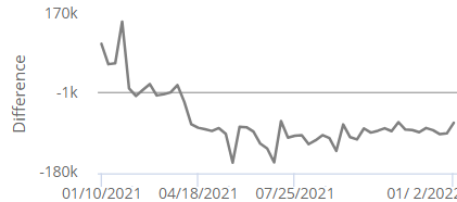
Graph difference between timeframes
(in V8.4.7+)
You can visualize the difference between timeframes in more charts. Just pick the new “Difference” option on the widget menu.
Gauge
A gauge can show the difference between two date ranges to provide a quick glance of how much a measure increased or decreased. For a budget measure, the gauge can show the difference between actual values and budgeted goals. As always, highlighting is available to spot changes that need attention.
Comparative/Multi Comparative
Comparative views provide visual comparisons of data groupings (e.g., regions) to show what increased or decreased the most.
Trend/Comparative Time Series
A trend of two timeframes can show the difference between corresponding dates. For example, how much higher or lower were results than the same time last year?
Mix
A mix chart can show a breakdown of changes in data values.
Scatter plot for dimension-level data
(in V8.4.7+)
You can plot dimension-level data on a Scattergram to find trends and outliers by attribute or grouping. For example:
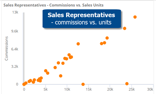
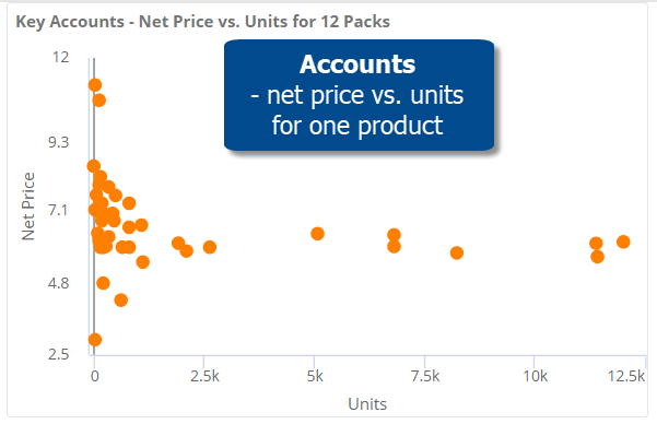
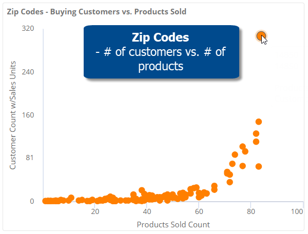
This new option supplements the key-level (e.g., customer) Scattergram available in previous versions.
More options for dynamic filters
(in V8.4.7+)
You can apply more types of filters within a dynamic filter to control the data used in the test. Now you can create filters by selecting members, “excluding” members, and combining multiple filters together, in addition to using the collection-based filters that were previously available in this area. For example, apply a dynamic filter to narrow down on products that are new to one business channel, but not others.
Improved sharing of dashboards with private collections
(in V8.4.7+)
If you share dashboards that have private collections, the dashboards will preserve their filter information, including regular collections (i.e. saved sets of members) and test-based filters. Therefore, users who don’t have rights to create global data can more easily share dashboards with other users in this version. Any private collections will be converted to regular (i.e., anonymous) filters. Any private dynamic filters will be saved and applied as test criteria. As a result, dashboard recipients will see the same data as the original user.
Enhancements in exception (test-based) analyses
(in V8.4.5+)
New features let you customize Exception analyses to more easily identify what does and does not meet expectations:
- Custom colors
- More test operators (> and <)
- Vertical bar graphs
- Simplified grids
Watch a video:
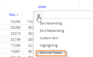
Custom precision
(in V8.4.5+)
You can choose the number of decimal places to display for any measure in a widget. For example, show fractional amounts for quantities if the data supports it; display cents for currency data; choose a custom precision for percent change data.
More access to data for Power Viewers
Power Viewers can add any measures, group data by any dimensions, or add any filters in view mode. This enhancement includes the ability to access data in other cubes (i.e., activities or data sources). These new options are available in all new and existing dashboards by default but can be turned off in dashboard settings if you wish to lock down a dashboard. As always, comprehensive security options allow organizations to fine-tune data access and functionality as needed.
Dynamic filters
This version includes test-based filtering to easily isolate and analyze parts of the business. Choose what to test and set custom criteria, which can include a single rule or multiple rules joined into more complex business conditions. Example use cases include active customers, new customers, lost customers, at-risk customers, new placements, active or allowed products, same store sales, and much more. After filtering, analyze the data in any of the powerful charts and grids available in Salient Dashboards.
Column filtering in Multi Comparative
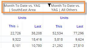
You can filter columns to compare results across any subsets of the data within a single widget—by building filters into individual columns or using interactive benchmarking options to compare whatever is selected to “all others” and custom cohorts. This new capability is available in the Multi Comparative analysis.
Individual column filters
Just click the column heading and choose how to filter the data: select from any available dimensions or keys, apply a saved set of members (i.e., collection), or turn on a dynamic filter based on test criteria. Filter any columns however you like to create customized views of performance.
Dynamic benchmarking
Apply a dashboard filter and set up columns to compare performance against benchmarks, such as industry bests and standards. This method of column filtering allows users to select what they want to compare from a menu. For example, compare a single account to “all others” and/or a top-performing group of similar accounts (i.e. cohort). The columns update dynamically based on whatever filter is selected at the time (e.g., pick a different account). Your organization can create custom cohorts for any part of the organization.
Advanced options:
- This feature can be used with password collections to provide automatic comparisons of user-assigned data to benchmarks.
- You can apply custom calculations using temporal fields to find the difference between columns or other metrics.
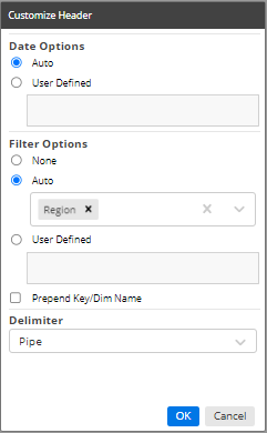
Custom column headers
You can customize column headers to help users understand what date ranges and filters they are viewing. “Auto” options are available to automatically update the headings based on the context of the data.
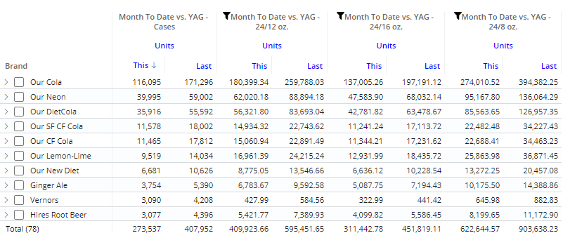
Equivalents by column
Equivalent units can be applied to individual columns. For example, display volume in terms of cases, 24 12-ounces, 24 16-ounces, and 24 8-ounces within one widget.
Improved usability
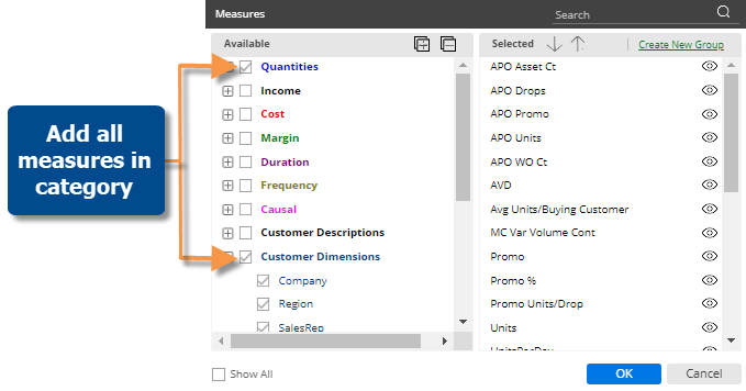
Shortcut to add all measures
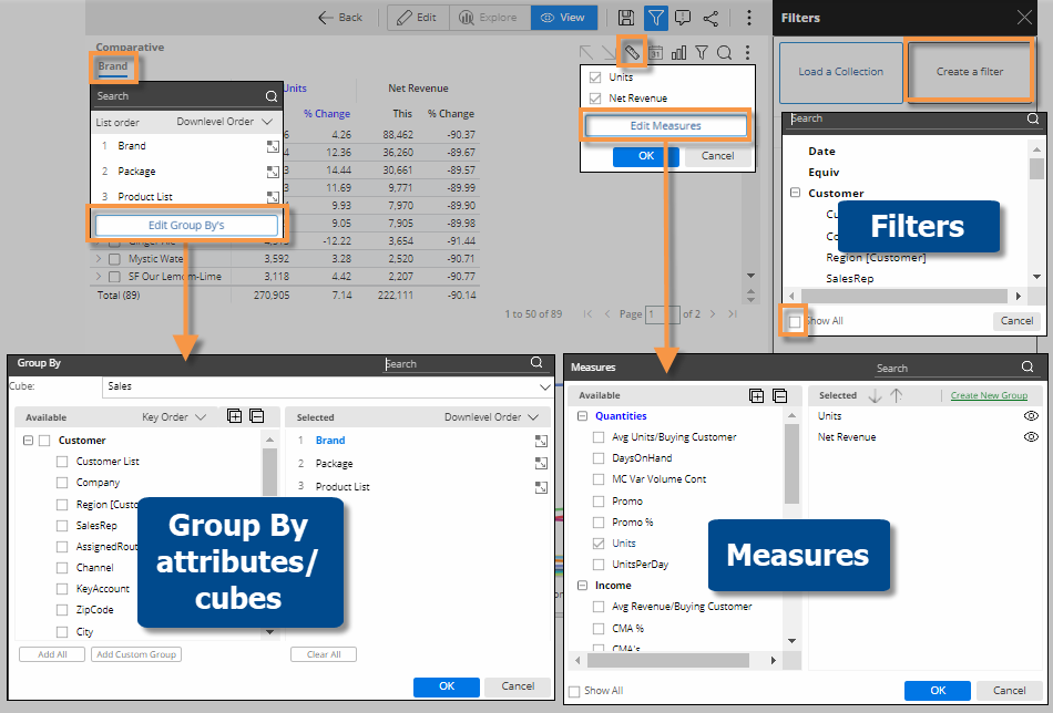
Add all measures in a category with a single click. This new feature also works with descriptions and dimensions in lists (e.g., customer or product lists) to quickly show all available information.
Cross-platform dashboard links
On a mobile device, a standard dashboard URL (i.e., http:// or https:// prefix) will take you to a landing page where you can choose to open the dashboard in the mobile app or a web browser. You can also choose your preferred method for future dashboard links. This enhancement makes it easier to view and share dashboards across different devices. Mobile dashboard links (i.e., salient:// prefix) open directly in the mobile app like in previous versions.
Easier image management
The image manager has new controls that allow you to search for an image and select multiple images.
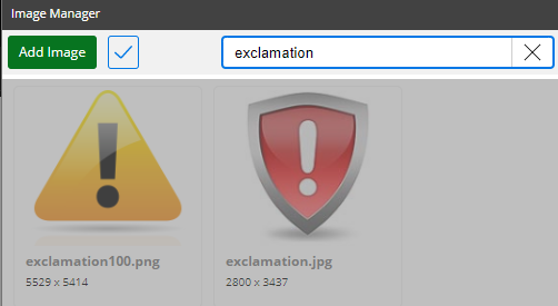
In addition, administrators can manage images in the Admin Portal.
Grid access in custom views
In custom visualizations, you can switch to grid mode to see the underlying numbers.
Administrative improvements
The Admin Portal includes more settings to provide easier configuration and management of datasets. For example, add custom color palettes, edit and create date presets, change the portal dashboard or default dashboard for exploring, and more. In addition, an administrator can add and edit server settings, including the display name, language, configuration file names, etc., when the Admin Portal is accessed on the Salient Dashboards machine (i.e., localhost). See the Salient Dashboards Installation and Configuration Manual for more information.
Version compatibility:
Required server version: 8.2 or higher
Compatible SIM version: 8.2 or higher
Learn more about Salient Dashboard versions: