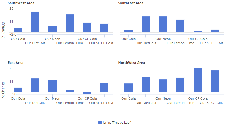
Trellis charts
The trellis chart (i.e., small multiple) shows performance across multiple people, places, and things. This new chart displays an array of small graphs for sub-categories to break the data into smaller pieces. The trellis makes it faster and easier for Dashboard Designers to build multiple visualizations into a dashboard. The designer can pick the layout (e.g., 2 x 2) and other settings, such as borders, custom headings, consistent member order, and more.
Standard trellis
When a standard trellis is on, each graph represents a top-level grouping (e.g., each region). The data is then broken down according to the next level (e.g., brands in each region).
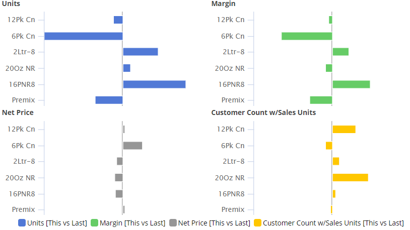
Measure trellis
A measure trellis is also available. A measure trellis shows a small graph for each measure, grouping the data at the top level. A measure trellis can help correlate and compare performance metrics.
More options for expanded graphs
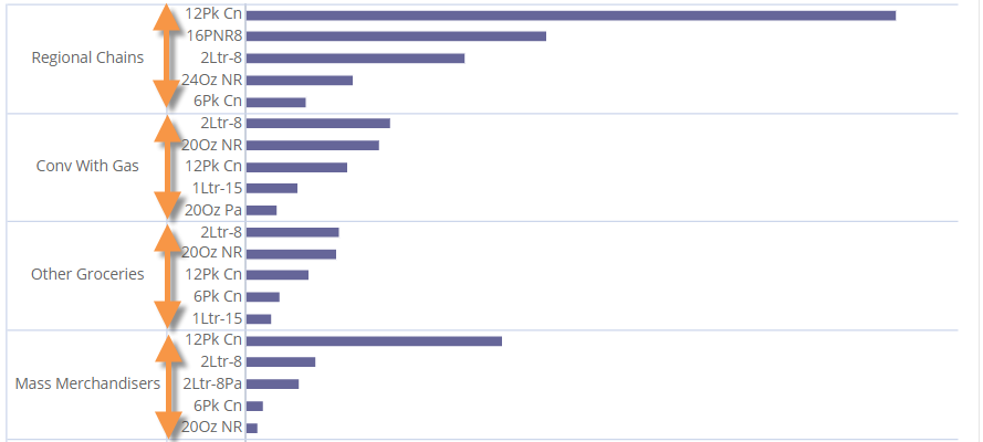
Starting with Version 8.0, you could expand dimensions to see data at a more granular level in comparative and mix graphs. In Version 8.2, you can choose how many subgroupings to show in each category (i.e., truncate expanded members). This new graph setting adds power and flexibility to expanded graphs by allowing you to fit the most important information on the screen.
Improvements in custom fields (i.e., rule-based fields)
Custom fields can incorporate business logic and calculations beyond the data in the UXT Server. For example, custom fields can make action-oriented recommendations based on criteria for multiple measures. In previous versions, custom fields were defined entirely within the Salient Dashboards configuration files. This version provides a new method for creating and managing custom fields via an administrative portal in the Salient Dashboards browser application. This new method has the following advantages:
- Simple user interface that includes import/export capabilities
- Greater flexibility due to C# programming language in the field’s formula
- Real-time changes and additions to custom fields
- Ability to run multiple iterations of calculations (e.g., in standard deviations)
The previous method for defining custom fields is still available. Contact Salient for more information.
Flexible date lookups
Your organization can create date lookup tables to allow Dashboard Designers and Power Viewers to replace calendar dates with dates that are more meaningful. For example, a lookup table could be used to compare calendar dates with specific business days during the previous timeframe. If configured, date lookups are available in the Advanced date setup area.
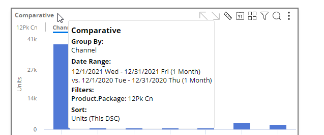
Better tooltips
Tooltips that show important information, such as how the data is grouped, date range details, filters, sort, and more, are easier to read in this version. Just place your cursor over a widget’s title bar to see its tooltip.
Version compatibility:
Required server version: 8.2 or higher
Compatible SIM version: 8.2 or higher
Learn more about Salient Dashboard versions: