More options for saving and navigating (in V7.71)
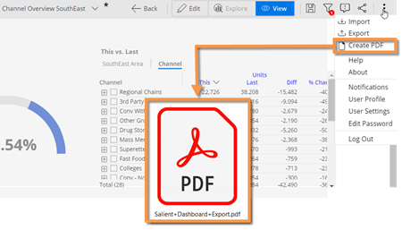
Create a PDF for sharing and printing
You can create a portable document format (PDF) file that shows the contents of a dashboard. You can then print or share the file to present facts about performance independently of the dashboard application. This new feature includes multiple options, such as headers/footers and single-page format.
Share any view
You can share a view even if you haven’t saved it as a dashboard. For example, share your insights when investigating the data in explore mode. In previous versions, only saved dashboards could be shared.
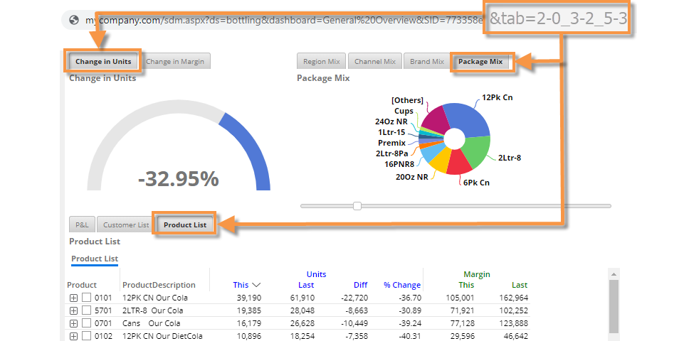
Go directly to specific tabs
When opening a dashboard, you can go directly to specific tabs by appending the dashboard URL with a tab parameter. Using this new feature, you can create separate buttons, web page links, emails, etc., that open different tabs within the same dashboard.
Enhanced visualizations
In Version 7.70+, graphs are easier to use and understand.
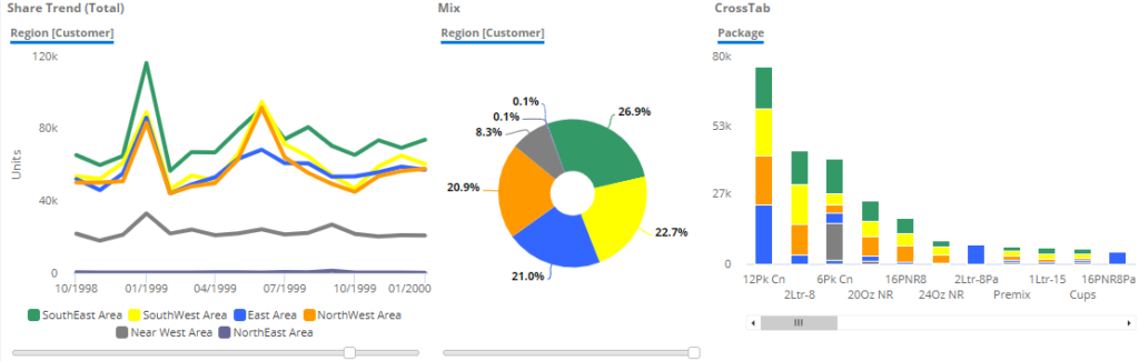
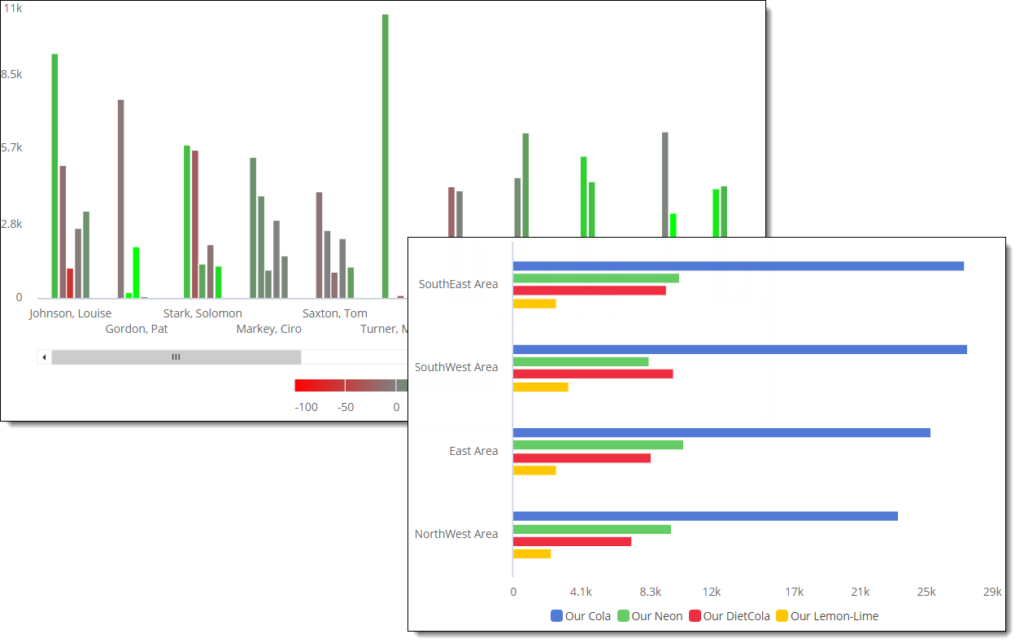
Consistent attribute coloring
Dashboard Designers can choose colors to represent various members or “groupings of data” across a dashboard. This new feature can improve visual understanding by applying colors consistently and, therefore, making data immediately recognizable. For example, a color might represent a certain region, brand, status, or any other attribute member. The color settings will be automatically applied to applicable widgets, which include Mix, Share Trend, and some Crosstab graphs.
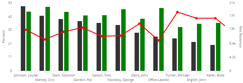
Comparative line graphs
In this version, the comparative graph can show data as lines, in addition to bars and markers. For example, you might use lines in conjunction with bars to make it easier to distinguish types of data. Lines might also be useful when graphing time-based or numeric dimensions. To turn on lines, go to visual options.
Custom ranges in two-way graphs
You can choose your own custom color scale in Crosstab graphs (e.g., Deltamap) to better represent your organization’s data values. For example, you might choose -25% to 25% to show percent change, or set custom thresholds for values. These settings are in visual options.
Smarter transitions between graph types
In addition, this version provides smarter transitions between graph formats (e.g., line, bar, point) when switching between analysis types. If you do not change the format, each analysis will use its default format even if you have started with a different analysis type. For example, if you start with a Comparative and then switch to a Trend without changing the graph format, the resulting graph will transition from bars to lines. However, if you choose a different format, the widget will retain this setting and apply it if you switch back to the original analysis type within the current session. This behavior can make dashboard building more efficient, but format history is not saved within the dashboard itself.
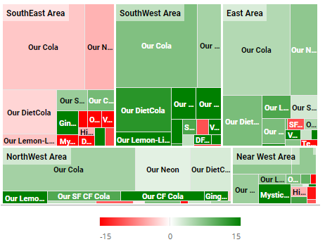
Crosstab (two-way) enhancements
New unstacked graph
The “unstacked” bar graph provides a simple visual representation of data grouped two ways at once, so that you can directly compare various cross-sections of data (e.g., brands in each region). Like other Crosstab graphs, this new format lets you color data by attribute member to provide visual understanding of what each bar represents, or by measure (values, % change, etc.) to identify variance and values.
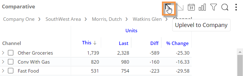
Simpler drilling in two-way analyses
Dashboard Designers can lock down the Cross By attribute to simplify data investigation for users. When the Cross By is locked, the Group By menu in view mode excludes the Cross By (x); therefore, users can drill and group the data (if allowed) while the Cross By remains unchanged. This new option is located in general settings.
In addition, this new option simplifies the drill path in graphs. Normally, graphs move down through two levels (1st By and Cross By) when a user double-clicks. When the Cross By is locked, drilling will move through the data one level at a time and keep the Cross By the same.
Heatmaps
You can create heatmaps of data values using a new highlighting option. When “heatmap” is on, cell shading is based on the percent of the total for a given column; the
darkest shades represent the largest values.
You can use the default color, which represents the data type (volume, revenue, etc.), or pick a custom color in visual options. This new capability makes it easy to spot highs and lows in grids.
Import filters
Users can import text files that list out members (i.e., local collections) to quickly filter the data. Importing is available in several types of filters, including workspace filters, individual widget filters, filter widgets (i.e., filter menus), and filter buttons. In addition, the imported lists can be used to create collections. To import a filter list, click at the top of the member selection window and then locate the file, which should have the CSV extension and include member codes on separate lines.
Improvements in row expansion
As in previous versions, you can expand grid rows to investigate multiple levels of data at once. This version includes improvements for these expanded rows.
Save expanded rows of data
Dashboards remember expanded grid rows in this version, so that users can see built-in levels of data when they open dashboards. To save these settings, just expand the desired row(s) and then save or share the dashboard.
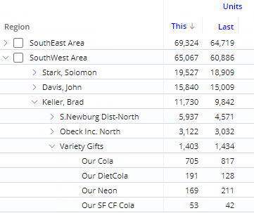
Drill up through multiple levels of data at once
After drilling down on multiple levels via expanded rows, you can quickly drill back up through these same levels with a single click.
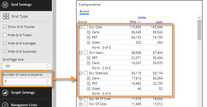
Automatically expand rows
A new setting can automatically expand the top grid rows to show an additional level of data for those items. For example, expand the top three brands, sales reps, accounts, etc., to see their details. Additional items may be manually expanded as usual. Dashboard Designers can choose the number of expanded rows in grid settings.
Hidden widgets (in V7.72)
A new setting is available to hide widgets. Salient Dashboards will turn off the visibility of hidden widgets in all modes and will not request data for those widgets. This setting is primarily intended for use in advanced configurations where plug-ins control widget visibility. In this type of setup, hiding widgets may improve performance by limiting data requests to widgets that are currently displayed.
Version compatibility:
Required Server/Metaserver version: 6.0.222 through 6.0.231. In general, the latest V6 server (currently V6.0.231) is recommended.
Compatible SIM versions: 7.50 through 7.70
Learn more about Salient Dashboard versions: