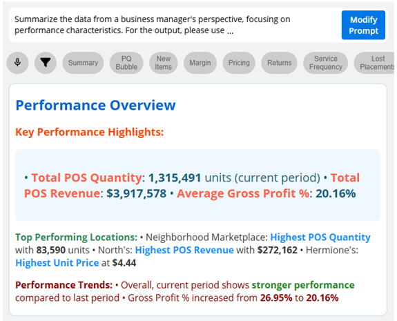
Leverage artificial intelligence for data analysis (in V8.6.5+)
This version allows communication with a Large Language Model (LLM) using a new API endpoint in a custom view. The resulting widget can assist with analyzing the underlying grid data and performing other tasks. For example, summarize data, perform trend analysis, detect outliers, and more. The possibilities are endless. The new endpoint is compatible with leading AI providers, including OpenAI and Anthropic.
Example:
Scatter plot enhancements
This version adds more information and customization options to scatter plots:
- Bubble chart – displays three or more variables in an engaging visualization of trends, correlations, and outliers.
- Color scatter plot – uses a color gradient or highlighting to show additional variable.
- Cross-date scatter plot – compares two timeframes.
- Visual options – include custom colors, sizes, symbols, and lines.
Watch a video:
Improvements in exception (test-based) analyses
- Actual value graphs – show how many passed and failed as well as the total number for each category.
- Graph shortcuts – allow you to list passing or failing members directly from the chart.
- Variance in passing/failing numbers – can be added to grids.
- Simplified graphs
Watch a video:
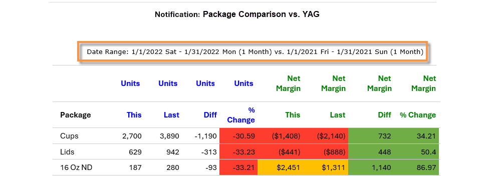
Automated notifications for each subset of data (in V8.6.1+)
Easily send separate notifications for different subsets of data using the new “for each” option—reducing the number of notification rules needed.
Watch a video:
Better control over test-based filtering (in V8.6.1+)
Test-based cohorts (i.e., dynamic filters) can update dynamically based on the filters that are currently applied to provide easier selection of specific groups of customers, products, etc. This new option is available for multiple types of filters, including widget filters, workspace filters, linked filters, downlevel, and notification filters.
Watch a video:
Linked widgets (in V8.6.1+)
Widgets can be linked together to enable filtering via a single click on a “source” widget.
Watch a video:
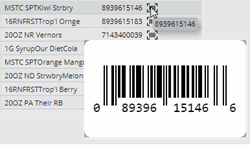
Scannable barcodes (in V8.6.1+)
Salient Dashboards can display UPCs as barcodes (requires some setup)—allowing you to scan barcodes directly from dashboards rather than manually entering product numbers.
Usability enhancements
Organize filters
This version lets you sort and group filters to make them easier to find.
Watch a video:
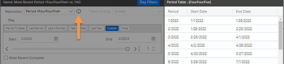
Fiscal period table information (in V8.6.1+)
You can access information about your organization’s custom fiscal periods, including start and end dates of each period, within Salient Dashboards.
More date information in column headers
Column headers in Comparative and Multi Comparative grids can show more information about the dates being reported.
Watch a video:
Custom background colors
Dashboards can be enhanced with custom background colors.
Watch a video:
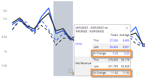
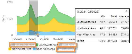
Variance metrics in comparative trend windows
As always in Salient Dashboards, you can click and drag in a trend chart to see values for specific periods of time. Now, if the trend compares two date ranges, the window also shows percent change compared to the corresponding dates (e.g. three weeks versus same three weeks last year).
Simplified share trend windows
If you hide items in a share trend graph prior to selecting dates (i.e., rubber-banding), the data windows will omit the hidden members—making it easier to view and compare what interests you.
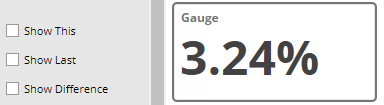
Streamlined numeric gauge
New graph settings let you streamline numeric gauges by hiding extra information, such as data values and difference.
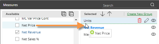
Drag-and-drop functionality for measures
When adding a measure, you can drag and drop it to a specific position in the list for faster control over how measures are arranged.
Quick-pick measures in Waterfall widgets
Multiple calculated measures can be added to a Waterfall widget to make it easier for users to switch between them.
Watch a video:
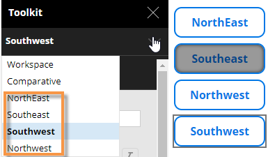
Button names (in V8.6.1+)
The toolkit and tab settings show button names, making it easier to move, edit, and delete buttons in complex dashboards.
More information in exported files
When you export data to a CSV or XLSX file, the file header will show the data source, including the dashboard name, tab name (if applicable), and widget name.
Cross-dataset dashboard importing
This version has improved logic to match up components by name (e.g., measure name) and then by ID if necessary when importing dashboards. As a result, dashboards can more easily be re-used across different datasets if naming conventions are the same.
Embedded date descriptions in notifications
Emails that contain embedded data from notifications can include descriptions of the dates being reported.
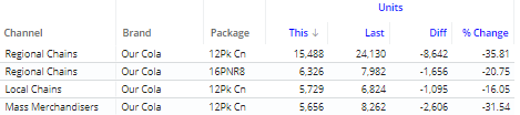
Flat data notifications
You can send notifications based on flat grid data. In this grid type, each attribute has its own column; rows can be sorted independently.
Version compatibility:
Required server version: 8.2 or higher
Compatible SIM version: 8.2 or higher (latest recommended)
Required Notify version: 2.3
Learn more about Salient Dashboard versions: