Watch an overview:
Group data with a single click
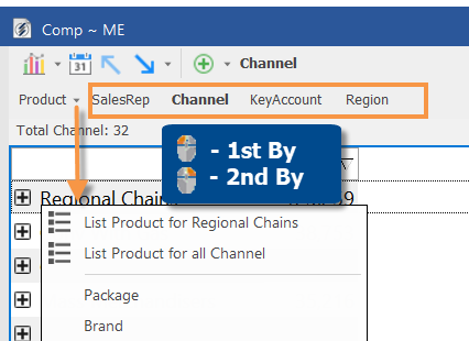
A quick access bar allows you to quickly change how the data is grouped (Group By). Left-click on a button to choose the primary way of grouping the data (1st By); right-click on a button to choose the 2nd By. The quick access bar may also include a menu(s) to provide access to multiple dimension of a key. The quick access bar is off by default, but can be easily turned on and customized to include any dimensions. Select Setup Quick Access Bar on the Keys drop-down menu or go to preferences to access these options. In addition, your administrator may configure the quick access bar for you by copying preferences to your user account.
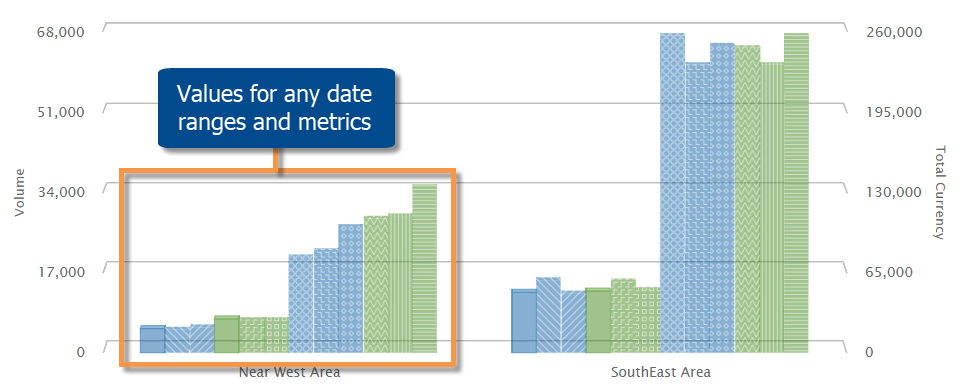
Graph performance for multiple date ranges
The Multi Comparative bar graph can plot actual values to provide a direct comparison of performance across any number of date ranges and data fields. For example, visualize results for several weeks, months, and years, all in the same view. The date ranges can be completely customized using Multi Comparative data setups.
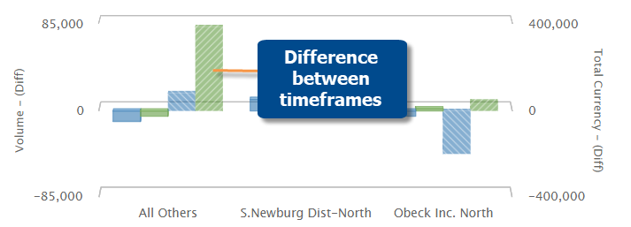
If the setup includes comparable timeframes during the previous year (i.e. Last), then you can graph the difference for multiple timeframes in this new graph type.
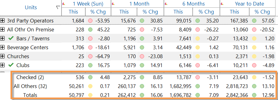
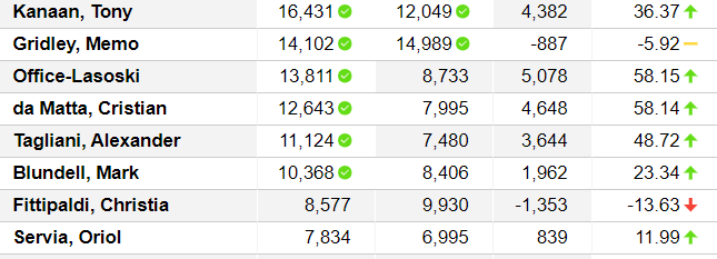
Highlight totals, averages, and subtotals
Highlighting can be applied to totals, averages, and subtotals (i.e. checked/others) in addition to regular data rows. This new capability makes it easier to identify summary metrics or time periods that fall within or outside the expected ranges. For example, total highlighting points out where overall performance meets expectations; checked highlighting is a visual indicator of performance for custom groupings. You can turn on this capability for any of your saved highlight settings. New highlight settings will have this option turned on by default.
HTML pages with highlighted data
HTML pages that are created by exporting, printing, and running macros, can now include highlighting if the settings have been applied in SIM.
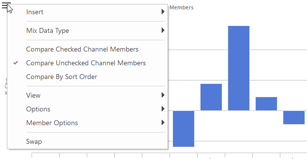
More options for picking items to graph
As in previous versions, you can select members using the checkmark tool, and then graph only the “checked” members to narrow down on your preferred subset of the data. Now, you can also graph the “unchecked” members in several chart types. For example, you might want to remove just a few items from the graph; simply checkmark those items and then graph the unchecked members.
Performance improvements
Faster login
This version loads information on an as-needed basis to provide significantly faster login times on large datasets.
More efficient processing of global user data
SIM will now refresh global user data, such as bookmarks, setups, collections, etc., by user data category rather than all at once to improve performance in datasets with multiple categories.
Version compatibility:
Required Server/Metaserver version: 6.0.222 through 6.0.232 In general, the latest V6 server (currently V6.0.232) is recommended.
Compatible Salient Dashboard versions: 7.50 through 7.80
Learn more about SIM versions: