Phone layout enhancements (V8.7.6+)
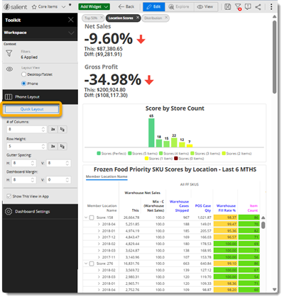
Phone layouts are intelligently designed by default—requiring less setup to make them consumable on phones and other devices in the mobile app. New dashboards will use the smart phone layout by default. A button lets you quickly apply the smart layout to existing dashboards. Layout enhancements include:
- Full-width widgets without overlap
- Auto-hide text, image, and button widgets to save space
- Tab style for small screens
Contextual information about filters (V8.7.6+)
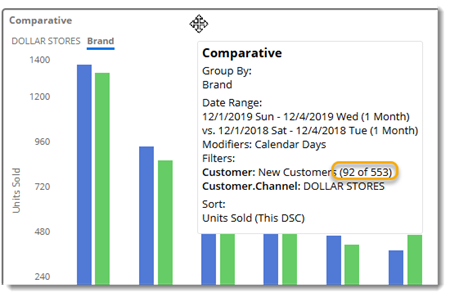
Dashboards can show contextual information about key-level filters (e.g., sets of customers) that are applied to widgets to provide a better understanding of the data you are viewing. This information includes the number of members that match the current context and the total number of members possible in the filter.
Schema explorer (V8.7.6+)
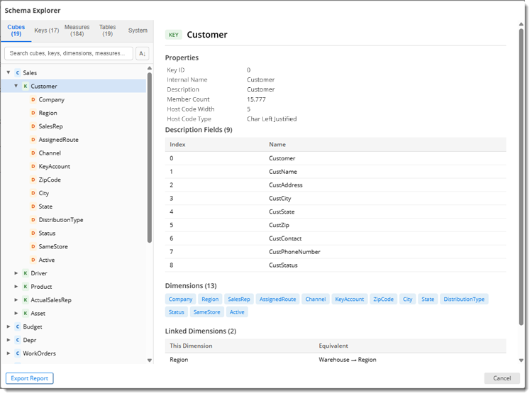
The new schema explorer lets you browse the data cubes, keys, dimensions, measures, and tables in your dataset. Search across every type of item, drill into the details, and export a schema report for review and sharing.
Preferred data cube (V8.7.6+)
You can choose your preferred data cube for new widgets, for example, if you typically build dashboards for a certain type of activity. In addition, administrators can pick the default data cube for the organization.
Optional location filtering (V8.7.6+)
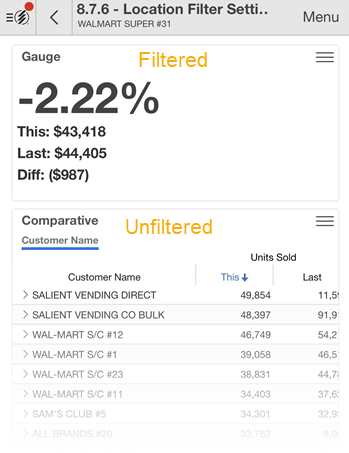
You can turn off location filtering for an individual widget, so mobile app users can filter by location in one place but not another. For example, see filtered values for one customer together with an unfiltered list of all customers.
Formula tooltips on rows (V8.7.6+)
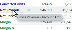
You can view a measure’s formula by placing your cursor over a row heading in a swapped or scorecard view. This capability was previously only available on column headings.
Automatic SSO login options (V8.7.6+)
A new URL parameter directs Salient Dashboards to attempt automatic SSO login—providing fast “no click” access to authenticated users. You can append this URL parameter to dashboard links, bookmarks, etc. In addition, administrators can enable this type of login globally if they wish.
Details in Geo lists (V8.7.6+)
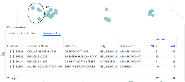
Lists created by selecting points in a Geo map contain details like address, contact information, sales rep, and more if that information has been added to the widget.
Cross-dim cohorts for benchmarking (V8.7.6+)
Benchmark cohorts can include peer members in a different dimension than the baseline. For example, a store might be assigned to dimensional store groupings based on square footage, annual revenue, or other attributes.
Other usability enhancements in V8.7.6+:
- Cut and paste in the image manager
- Axis customization for Share Trend
- Options for sharing a private dashboard that includes a private collection in a custom grouping
- Easier access to period table information
Administrative enhancements (V8.7.6+)
This version includes several enhancements to help manage and optimize the Salient system.
- Improved logging and system diagnostics
- New performance settings
- Easier setup for benchmark cohorts (includes cross-dim cohorts)
- Embedding Salient Dashboards in an iFrame (additional setup required)
- New PDF timeout setting
- Default data cube
Sync dates across Multi Comparative columns (V8.7.4+)
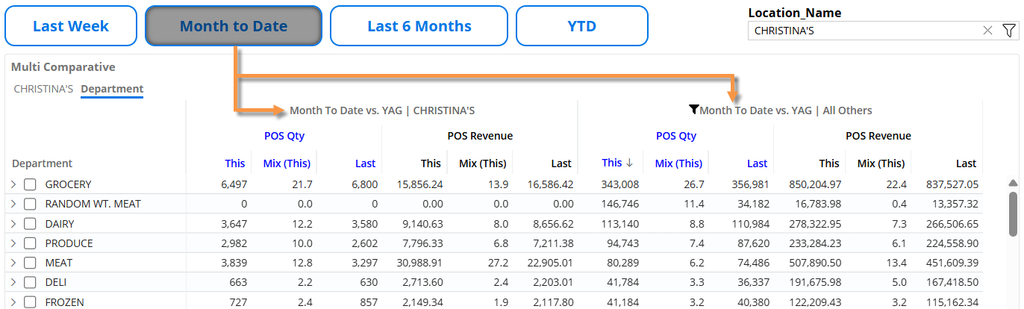
You can synchronize the dates of all columns in a Multi Comparative widget using a new option in general widget settings. This option is useful when multiple columns compare different parts of the dataset (for example, one customer versus other customers) for the same timeframe. When columns are synced, users can click a date button or use another date selection method to update all columns at once.
Share Trend improvements
Share Trend widgets compare the performance of people, places, or things over time. This version has the following enhancements:
- Multiple measures – In a chart, each measure has its own graph; the graphs are stacked and synchronized for easy analysis of variables over time. In a grid, multiple columns under each date show the measures. In addition, you can expand calculated measures in a grid.
- Auto-expand data – View additional levels of detail over time in either a hierarchical tree or a flat view.
- Percent of total (mix) – Add mix calculations alongside actual values to see share of the market over time. Various types of mix calculations are available.
Watch a video:

Notification enhancements
- Easier schedule selection – Select daily, weekly, or monthly, and then choose details. Notify will create the cron expression for you.
- Processing time – Optionally, choose an earlier time at which to start processing the data so that it is ready for prompt delivery at the scheduled time.
- Cancel button – You can cancel notifications if they have started processing but haven’t sent yet.
- Testing notifications – You can send test notifications to any or all of the notification’s recipients.
- View job schedules – The Admin Portal shows processing and delivery times for easier management of active notifications.
Watch a video:

Image management
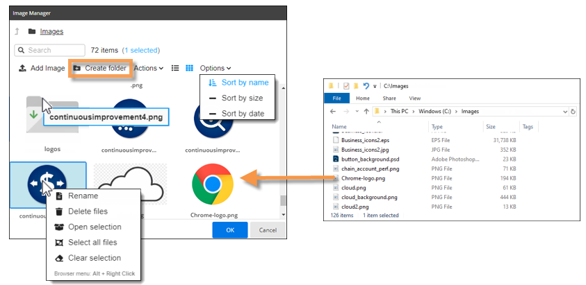
This version makes it easier to manage images in Salient Dashboards. Enhancements include:
- Create folders for organizing images
- Upload multiple images at once
- Drag and drop from file explorer to Salient Dashboards
- Sort images
- Rename images and folders
- View more details about images
Granular data in Crosstab analyses
You can view fully granular data in Crosstab widgets, which break down the data by two different categorical variables at once.
- Auto-expand data – View additional levels of detail across another dimensional attribute in either a hierarchical tree or a flat view.
- Key entity data – See list level data in a Crosstab (for example, individual customers across packages or brands).
Watch a video:

New options for dynamic (test-based) filtering
- Text-based criteria – Dynamic filters can include rules for names and descriptions to narrow down further on specific people, places, or things. Options include case-sensitivity, “begins with” or “contains”, etc.
- Filter by dimension – You can test data at the category level (for example, sales representatives, regions, brands, etc.) and narrow down on results. Previously, dynamic filters were only available at the key level.
Watch a video:

Totals at the top
A new setting lets you show totals, averages, and subtotals at the top of grids. This enhancement provides fast access to summary data.
Watch a video:

Highlighting in test-based analyses
You can use highlighting in Exception analyses to easily identify when the numbers of passing or failing members meet expectations or change significantly.
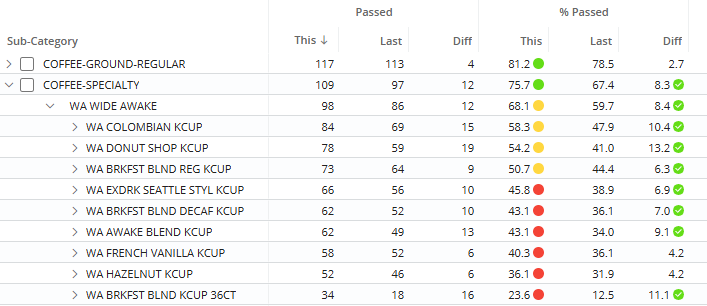
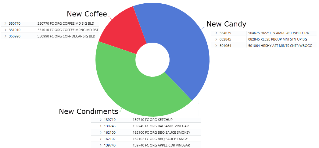
Custom groups of key-level data
You can create custom groups of customers, products, and other key entities to analyze and compare them. For example, group any products together to compare them with other custom sets of products. This feature was previously only available at the dimension level.
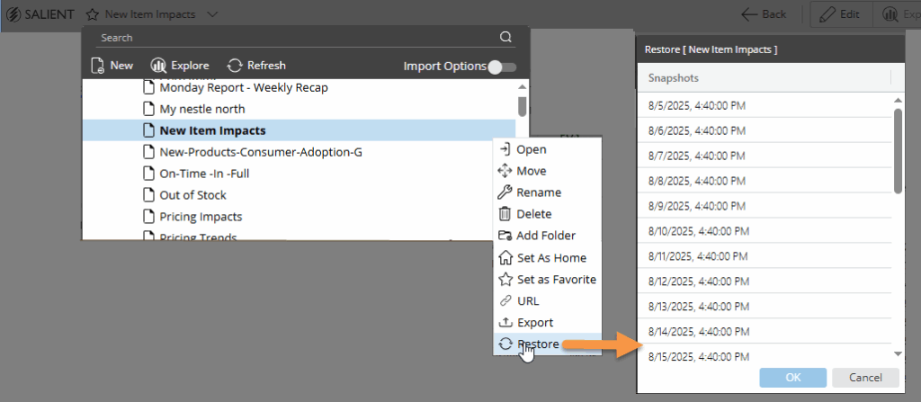
Dashboard restoration for users
You can restore a previous version of an individual dashboard from within the Salient Dashboards application (requires the latest user data service).
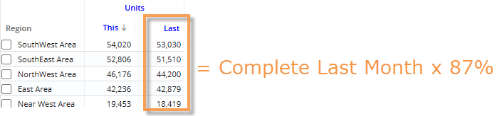
Custom comparisons for incomplete timeframes
Weighted day tables can provide custom comparisons of incomplete timeframes versus a year ago. This feature adjusts the data for the previous date range based on a percentage of the current month or period that is expected to have occurred by a given date. Additional setup is required.
View dataset tables
You can view information about more types of custom tables (equivalents, currency, business day, and weighted day) within Salient Dashboards. Your solution may use these tables to customize the calendar and convert data for analysis purposes.
Version compatibility:
Required server version: 8.2 or higher
Compatible SIM version: 8.2 or higher
Learn more about Salient Dashboard versions: